
SHOW, DON’T TELL. That’s the general idea of infographics, which use visuals to make numbers/stats/processes easier to understand. While it’s easy to enjoy a well crafted infographic, creating one can be challenging. What type of visual fits your data? How should you style your graphic? What tools can you use to create infographics without starting from scratch?
Making an infographic is a multistep process, so we’ll break this tutorial into two parts. In this lesson, we’ll walk you through the basics of making your own infographic, depending on the data at hand.
—
BACKGROUND: Types of Infographics
Definition: An infographic is a design or image that presents data in a way that enhances meaning and instant understanding of facts/data.
Once you’ve identified the data that you want to visualize, the next step is to try out different ways to pick out what type of graph, chart, diagram or icon best shows off the significance of the information. While this may seem intimidating, keep in mind there isn’t just one”right” way of turning your information into something visual. However, there are some best practices that can help you figure out where to start.
In this Youth Radio handout, we’ve put together a list of some of the most common types of data visualizations along with some tips on when and how to use them.

HANDOUT: A few Common Types of Data Visualizations
—
ACTIVITY: Finding the best visual for your data
Objective: Students will develop their critical thinking skills related to data visualization, including how to determine which types of graphs fit the data.
Time: 1+ hour
Grade: 7th or higher
Materials:
- Video/audio player
- Graph paper/pencil OR graphing calculator OR computer with access to the Internet
- Handouts (see below)
Instructions:
STEP 1: Introduction (1 minute): Introduce the concept that numbers tell a story. Data gives us a sense of the scale, relevance, and importance of a story.
—
STEP 2: Background/Story (5 minutes): Have your students listen to the Youth Radio story “The Understaffing of Juvenile Hall.” This story will provide context for the data set we will use for the activity.

“The Understsaffing of Juvenile Hall” (Youth Radio/NPR) – AUDIO
This story is part of Youth Radio’s NPR series, “Unlocked,” a three-part investigation into alternatives to juvenile incarceration – both model programs and cases that raise serious concerns. Building on four months of reporting, Youth Radio takes listeners inside the juvenile justice system, revealing how the move away from juvenile incarceration doesn’t always play out the way reformers intended. For this story, Youth Radio producers and reporters worked together to gather data from Alameda County about conditions within its Juvenile Hall.
—
STEP 3: Interactive Video (3 minutes): Let your students know that they will be using the data that Youth Radio collected from Alameda County to practice creating a basic infographic. First, they will watch a short video about how Youth Radio teen reporter Soraya Shockley worked with producer Teresa Chin to turn the data into something visual.
—
STEP 4 (5-10 minutes): Ask your students which type of graph they think they would use
Consider the data set mentioned in the video:
Average Daily Population of Alameda County’s Juvenile Hall
- 2009 – 232.3 people (average) per day
- 2014 – 156.3 people (average) per day
Ask your students to vote on which of the following types of graphs would they think would best match the data. Why?
- (a) A bar graph
- (b) A pie chart
- (c) A line graph
*TIP* Consider having students read the Youth Radio HANDOUT: A few Common Types of Data Visualizations
—
STEP 5: Graphing Practice (10-15 minutes): Have your students use Create-A-Graph, excel, graph paper, or another graph generator to create a bar graph, pie chart, and line graph using the Average Daily Population data.
If you use Create-A-Graph, your graphs will look something like this:


—
STEP 6: Discuss each the three types of graphs (10 minutes)
- Look at each graph. On first glance, how would you interpret each graph?
- Which one is the most clear to you? Why?
- If the average daily population of juvenile hall is going down, how would you expect that to affect conditions? Why?
- How might you measure this assumption? What data might you ask for?
—
STEP 7: Watch Part 2 of the video to find out the answer (1 minute)! This doesn’t mean it’s the ONLY right way to visualize this data, only that it was Youth Radio’s choice for the story.
Here is the final version of the infographic that we created for Unlocked:

—
STEP 8: Additional Practice (10-15 minutes): To give your students extra opportunities to practice in class or as homework, have them consider this additional data that Youth Radio gathered for its juvenile justice story.
|
Alameda County Juvenile Hall Statistics | 2009 | 2014 | % change |
| Average Daily Population (Juvenile Hall) | 232.3 | 156.3 | -32% |
| Total number of fights | 172 | 179 | +4% |
| Total number of incidents involving Pepper Spray | 137 | 147 | +7% |
| Total number of incident involving restraints | 78 | 225 | +188% |
(a) Using the above data that Youth Radio got from Alameda County, have your students create mathematically accurate visuals. Use Create-A-Graph, excel, graph paper, a graphing calculator, or another graph generator. Tell them they can choose to make make several graphs (per category) or you can combine the stats to make one big graphic.
(b) Look at these two bar graphs generated using the data above.

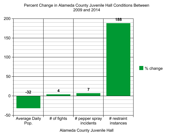
Discussion Questions:
- Look at each graph. On first glance, how would you interpret each graph?
- Which one is the most clear to you? Why?
—
ADDITIONAL RESOURCES:
- A math teacher’s video tutorial about common types of graphs
- A website introduction to types of graphs
- A list of free and fun data visualization tools from Poynter.org
—
A FEW AWESOME & INTERACTIVE INFOGRAPHICS:
- Ever wonder which rappers have the biggest flow vocabulary? This interactive infographic charts the word choices of your favorite artists.
- Game of Thrones fans rejoiced when the Washington Post put together a flow chart of all 456 deaths in the popular HBO fantasy series.
- Ever aspire to be a professional athlete? Well the odds aren’t always in your favor. Check out this interactive infographic by Ryan Sleeper.
- Get an interactive tour of the complete history of social media, with help from a fuzzy, blue, animated yeti.
- Cute graphics and an interactive timeline make this history of the game console an interesting infographic.
—
Stay tuned for Part 2 of Youth Radio’s Infographic Curriculum, where we learn how to stylize your infographic using basic design principles.
